Design Work
1 my7 [ android and iphone social product ] : The concept of my7 grew out of need for curated ecommerce and landed in the form of social media. User experience and minimalism were my north star. Tough space to break into. Launched in mid 2016, we shuttered the doors in 2018. But the design still holds up even if the marketing wasn't strong enough to break through. On to the next one!

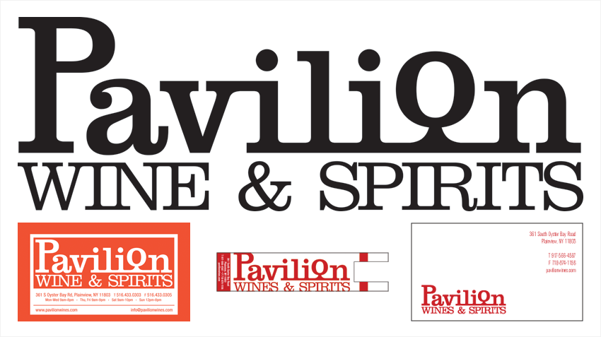
2 Maya Wine Merchants [ wine store signage ] : My friend Pradeep Massand has a few wine shops in Long Island and asked me to design the signage for some of them. Pavilion in Plainview turned into a logo job that went to gift cards, door wrappers, biz cards and tote bags. Beer and Beverage Depot in Valley Stream, Crossroads on 14th Street and Wine & Spirits Market on 6th Ave in NYC completed this phase. Now into wine labels...more to come on that soon.

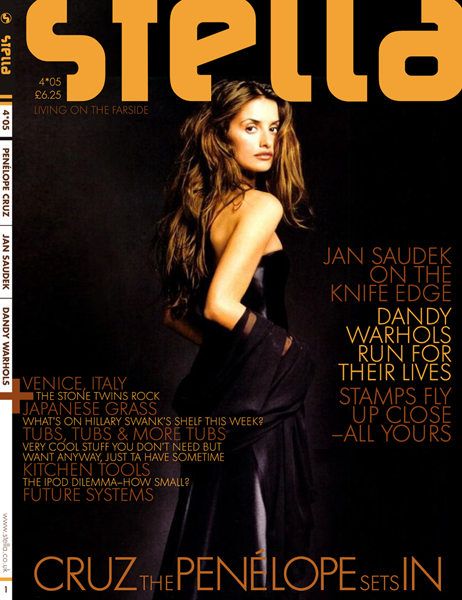
3 Stella Cover [ editorial exploration ] : Stella was a sample book that I created while at SVA. A competitor of GQ and Esquire, the book needed a strong, smart design...crisp and clean. Opting for sans serif slugs and headlines, the Sol font gave it a sleek look and complimented the contemporary editorial commentary on art, architecture and music.
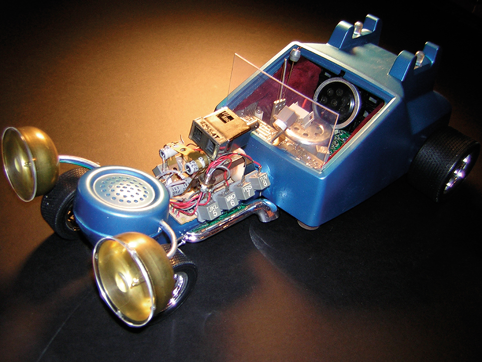
4 Off the Hook [ found art sculpture ] : Assignment: Given a conventional telephone as a depature point, create an object in a new and unconventional way. Solution: Inspired by George Barris I created "Off The Hook". Utilizing 97% telephone parts, this 500 horsepower Chrysler Hemi engine dragster would be a welcome addition to any Rat Fink crew. Size: L25" x W9" x H7"
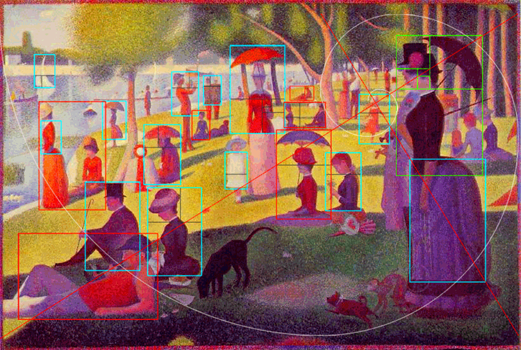
5 Golden Rectangles Found in Classic Art [ study ] : Nature and classic art are full of examples where the Golden Proportion or Rectangle can be found. So to see Seurat embrace it in his classic work is understandable. If you know what this is, then you can stop reading now. If not...the Golden Rectangle or Ratio is defined as a rectangle that can be partitioned into a square and a smaller rectangle which has the same aspect ratio of the original rectangle. We find it in the Mona Lisa, the Parthenon and the shape of the shell of a chambered nautilus. Happy hunting!
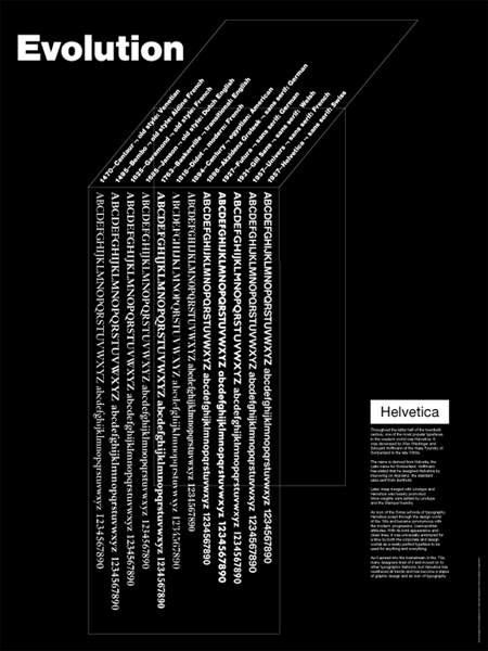
6 Evolution Poster [ poster ] : When I designed this poster, I had just taken a great set of typography courses at SVA. Ed Benguiat was the highlight and has been a huge influence in my work. He said that he had an eye in his finger that, as he followed along, he could tell if the slightest letter spacing or baseline was off with my type work. Thin, thick...
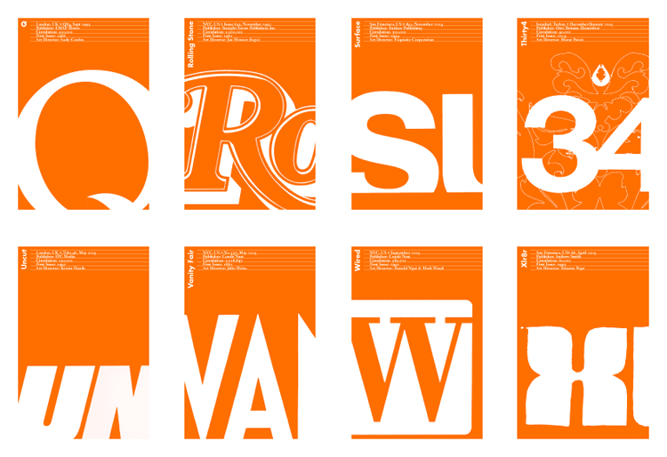
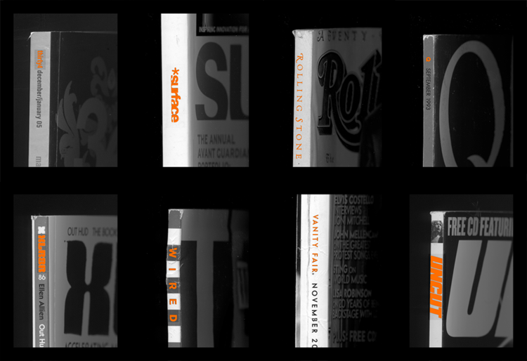
7/a&b Magazines A-Z [ card deck ] : Did an alphabetical deck of cards with a focus on magazines and their logos; the first letter and details on one side and a picture of the spine on the other. I was obsessed with editorial design and spent a fortune on British lad rags: some of the best design out there.
8 PanAm Logo Redesign [ study ] : My grandfather worked as a mechanic for PanAm. I grew up in New York where the PanAm building was the center of Manhattan. The PanAm logo always held a special place in my heart so it was natural that I should be drawn to redesigning it as part of a logo study a few years ago. The font Eurostile Bold Extended was a natural place to start and extending the color coding through the fleet was part of the exploration.

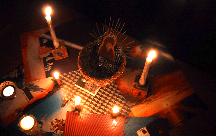
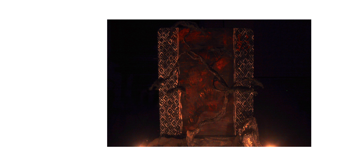
9/a&b Shrine to Milo, My Son [ found art sculpture ] : In 2003 I went through a found art sculpture phase. I am such a pack rat that I could make a ton of this stuff if I had the time. Seeds, acrylic paint shavings, a flowerpot, old wood children's blocks and The Who Sell Out on a permanent loop in my headphones. Complete darkness punctuated by the four stands of light with the four pieces lit by candlelight, 25 feet apart from each other. You had to travel through the dark from one to another to discover what I had left there. This sculpture is called 'living alter' - flower pot, acrylic paint, tea leaves, bass guitar frets, wire mesh, plaster, polaroids, stock art images, children’s blocks and candles.

10/a Shadowhand Book [ hand made book ] : cover :: redwood shingle, masonite, 1/4 in bolts and a burlap coffee sack. paper :: 90lb archer platine white.
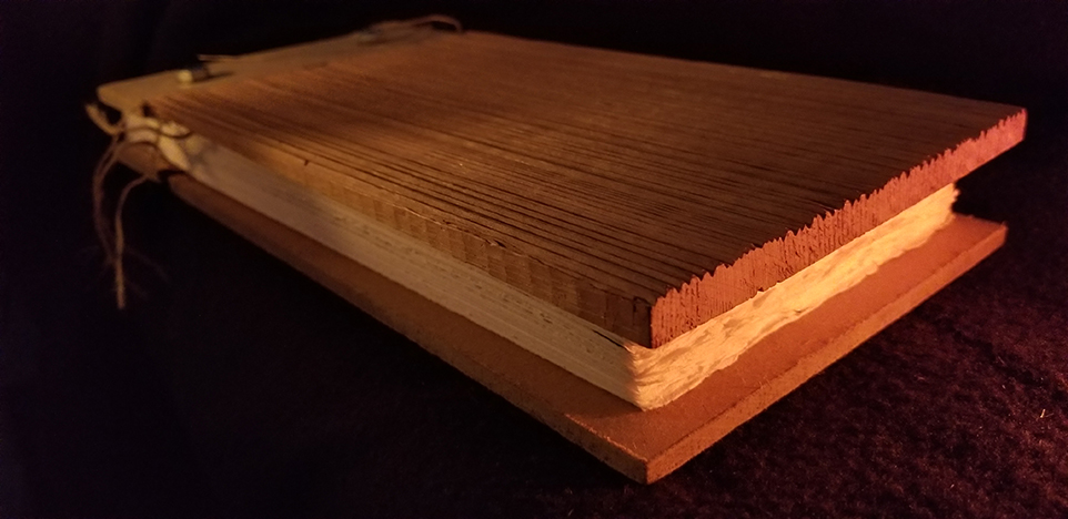
10/b Shadowhand Book [ page w/ sculpture ] : sculpture :: Shrine to Milo, My Son - (see above).
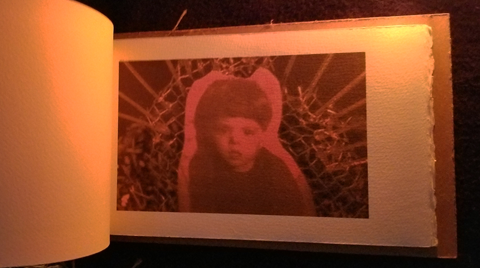
10/c Shadowhand Book [ page w/ sculpture ] : sculpture :: shadowhand - sucrets box circa 1940, pewter hand, wire, dried crimson and orange oil paint shavings, keys and candles.

10/d Shadowhand Book [ page w/ sculpture ] : sculpture :: milobox - candy sampler box, construction paper, milo art, thread, paint and polaroids.
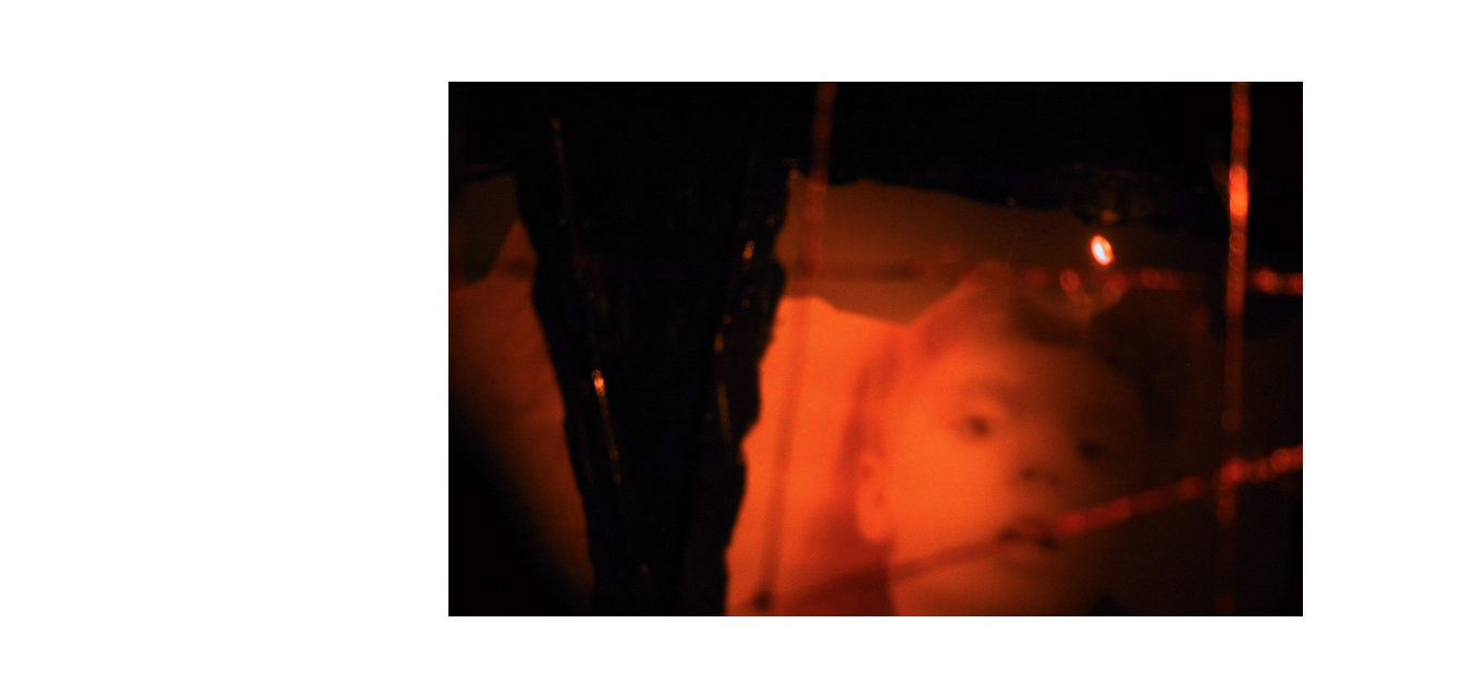
10/e Shadowhand Book [ page w/ sculpture ] : sculpture :: shadowtree - wire, clay, paper, rocks, plastic, acrylic paint, canvas, model tree foam, turkish brass cups and candles.
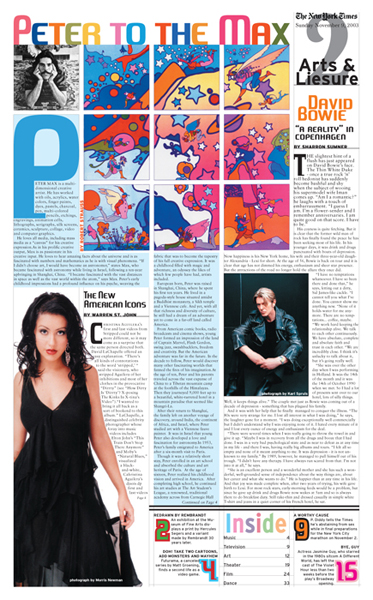
11 NY Times Art Section [ study ] : One of my favorite SVA projects was where we had to redesign the NY Times. Peter Max has always been a favourite artist of mine so I jumped at the chance of featuring him large on the cover page. Bowie, too. You can tell this is from the early naughts due to the inclusion of a dark haired Aguilera. School was inspirational!
